
A strange-looking warning sign telling drivers to measure their vehicle’s width before entering a tight stretch of road has turned a quiet safety message into a viral argument over how clear road signs really are. The symbol, which shows two vertical lines squeezing together, is meant to stop head-on crashes where a road or bridge suddenly narrows, yet plenty of drivers say they have no idea what it means at first glance. That confusion is colliding with a broader push to clean up “clever” messaging on highways and make safety signs more literal, even if they look a bit bizarre.
The debate comes as transportation officials are rethinking everything from jokey electronic billboards to blunt low-bridge warnings. The question is no longer just whether a sign follows the rulebook, but whether a driver in a Ford F-150 or a Tesla Model Y, glancing up for half a second, can actually understand it in time to avoid a front-end collision.

How a “bizarre” sign is supposed to save drivers from head-on crashes
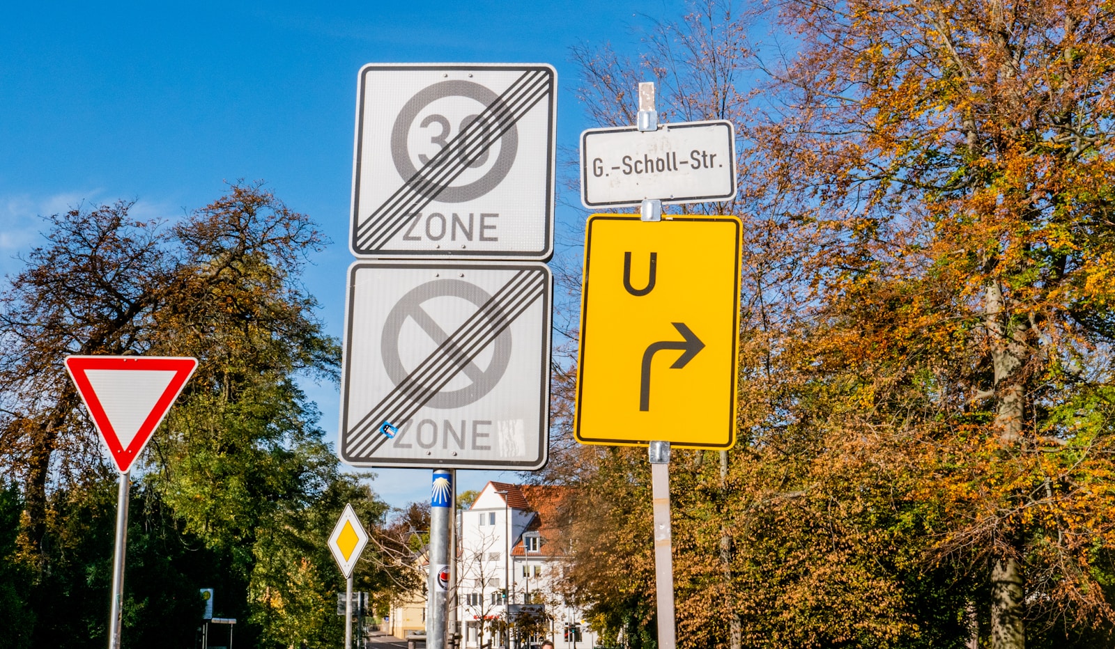
The controversial warning grew out of a very specific problem: drivers barreling into narrow bridges and tight chicanes without realizing there is barely enough room for two vehicles to squeeze past each other. The symbol that has triggered so much chatter shows two thick vertical bars that appear to pinch inward, a graphic shorthand meant to tell drivers the road ahead is about to shrink and that they should check whether their vehicle is too wide before committing to the gap. Reporting on the sign describes it as a “BIZARRE” road symbol that is “giving drivers a headache,” yet the underlying message is simple: if a pickup, van, or box truck is already flirting with the edge of its lane, one bad guess about width can turn into a head-on crash with oncoming traffic, especially where there is no shoulder to escape to, which is exactly the scenario flagged in the coverage of the Bizarre road sign.
Behind the viral outrage, the sign is really just a stylized cousin of the standard yellow diamond that warns of a Narrow Bridge ahead. The classic Narrow Bridge symbol is designed to tell drivers that the structure in front of them can technically fit two lanes of traffic, but there will be very little spare space on either side of a car or truck. Guidance for that sign urges drivers to slow down, keep a steady line, and watch for oncoming vehicles, because even a small drift across the center can turn a tight crossing into a head-on collision. The newer, more literal width warning tries to go one step further by nudging drivers to think about the actual size of their vehicle, especially if they are hauling wide mirrors or cargo racks that might not clear a constricted lane.
Confusing graphics, blunt words, and a crackdown on “funny” signs
The odd-looking width sign has also tapped into a wider argument about whether road messages should aim for clever design or plain English. Some drivers say the converging lines look more like abstract art than a safety alert, even though traffic engineers point out that similar graphics already exist to show a road narrowing from wide to tight. Guidance on these warning symbols notes that the lines usually move from wide to narrow to signal that the pavement is about to get tight and that in some designs a dashed center line shows that the shoulders will be completely eliminated, exactly the kind of detail that appears in explanations of how lines usually move on these signs. The more intricate the graphic becomes, though, the more it risks turning into a puzzle that drivers have to solve while already in the danger zone.
Transportation agencies have started responding to that risk by experimenting with much blunter language. Earlier this year, officials in Delaware installed ground-level signs on the approach to a low bridge that simply tell truck drivers “Your truck will not fit,” a message that leaves no room for creative interpretation and is described in coverage of how Earlier this year new warnings were added. That shift toward literal wording is happening at the same time federal officials are moving to rein in humorous highway messages. Coverage of a coming ban notes that “Highway safety messages” that lean on puns or jokes are being phased out, and reporter Leo Bertucci of the Louisville Courier Journal described how agencies have used humor to promote safe driving but are now being told to get serious.
More from Wilder Media Group: